REBRAND
Alta Arizona
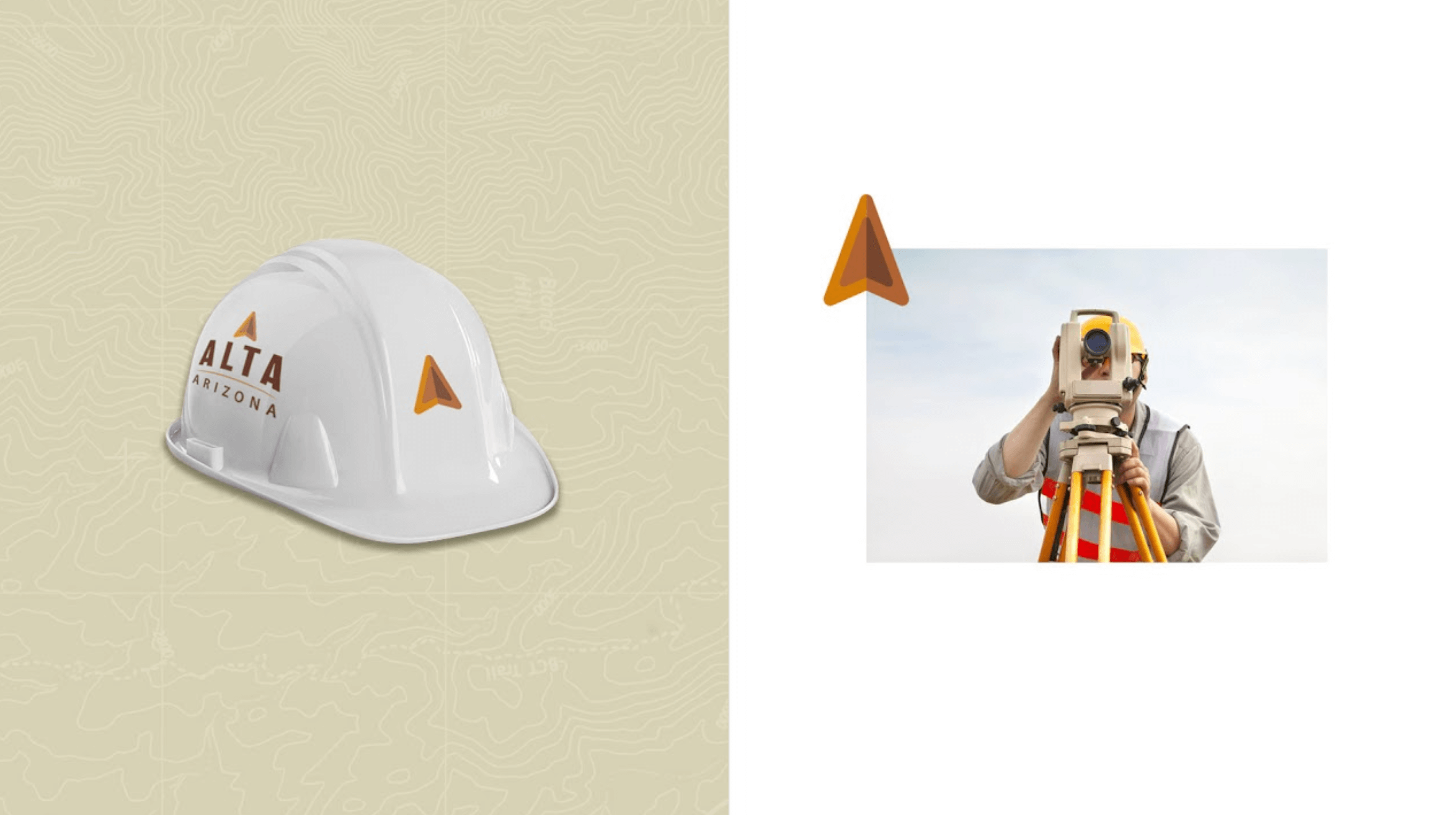
A rebrand with strong bold letters, earth tone friendly color palette and directional mark to signify Alta's services in land surveying and mapping.
OVERVIEW
ROLE
✓ Identity Development
During the development process numerous marks and typefaces where explored. This is often the most interesting part of the process because you really get to drive the look in new directions.
Here we have examples of some variations of the process.